Patient Readiness Center
Optometry associates and doctors encounter challenges in keeping their patients well-informed and satisfied. This can lead to misunderstandings, errors in order processing, and missed appointments, ultimately resulting in revenue loss due to customer dissatisfaction, unused time slots, and wasted time and resources because of ineffective workflows.
⟵ Back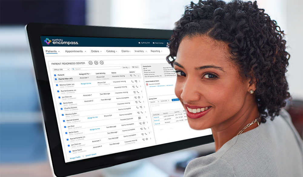
Organizations:
VSP Vision Care
- VisionWorks
- Eyefinity
Project:
Encompass:
- Patient Rediness Center
My Role:
Sr. Manager Product Design
- Vision and Strategy
- Lead Design Work
- Team Management
Goals:
Elevating Eye Care Experience:
- Reduce Office Staff Frustration
- Increase Personnel Efficiency
- Increase Business Profitability
The Problem
Optometry processes are often complex and disjointed, resulting in inefficiencies and frustration for optometrists, office staff, and patients. The workflow includes steps such as keeping patients informed about eye exam appointments, updating insurance information and demographics, and ensuring all orders are processed correctly according to prescription details and customer choices while using the full extent of the patient's benefits.
The Solution
A set of dashboards designed for specific personas to maximize office staff efficiencies, enhance customer experience, and contribute to the success of optometry practices. These dashboards include the use of AI and automation technologies as well as the implementation of best practices for process improvement and UX.
My Contributions
- Conducted a comprehensive review of the optometry process.
- Identified several gaps affecting both, patients and office personnel
- Directed UX and PM teams through "Discovery" process.
- Maintain the team focused on most valuable gaps.
- Managed design, implementation, and executive presentations.
Optometry Process Review
To validate our assumptions, I guided the UX team in conducting Heuristic Evaluations, Cognitive Walkthroughs, and a series of customer interviews throughout the optometry journey for large and small organizations. As a result of these efforts, we identified gaps and opportunities to improve the end-to-end process for store associates, doctors, and patients.
Workflow Analysis
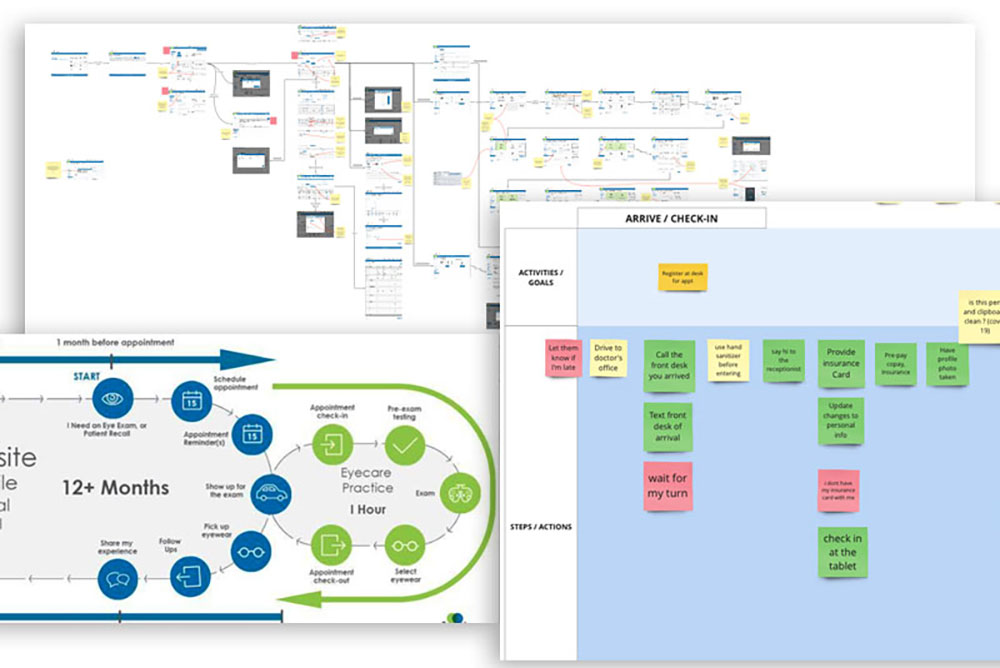
Findings
Store Associates:
- don't have a comprehensive view of incoming patients.
- need to verify all customer data from multiple sources before appointments.
- make redundant, overlapping calls to patients and leave others unattended.
Optician & Doctors:
- no visibility of business metrics and key performance indicators.
- spend too much time chasing paperwork to keep things running smoothly.
- have poor visibility of office personnel workflow.
Patients:
- miss appointments and have to reschedule.
- become frustrated as they spend more time at the practice filling out forms.
- are unsure about insurance benefits, treatment and order costs.
Affinity Diagrams
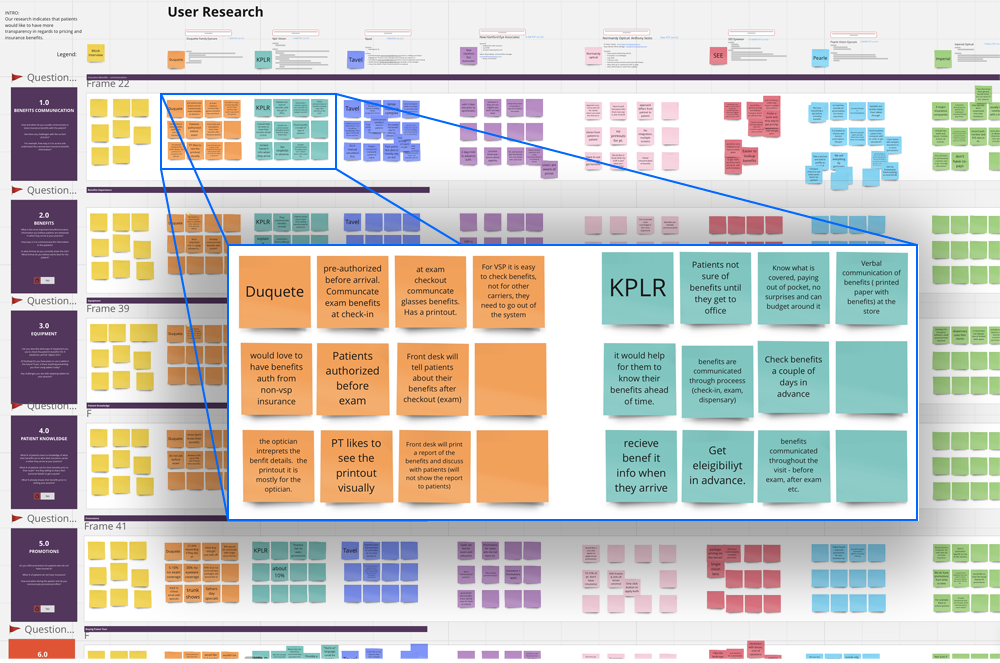
Product Gaps by Personas
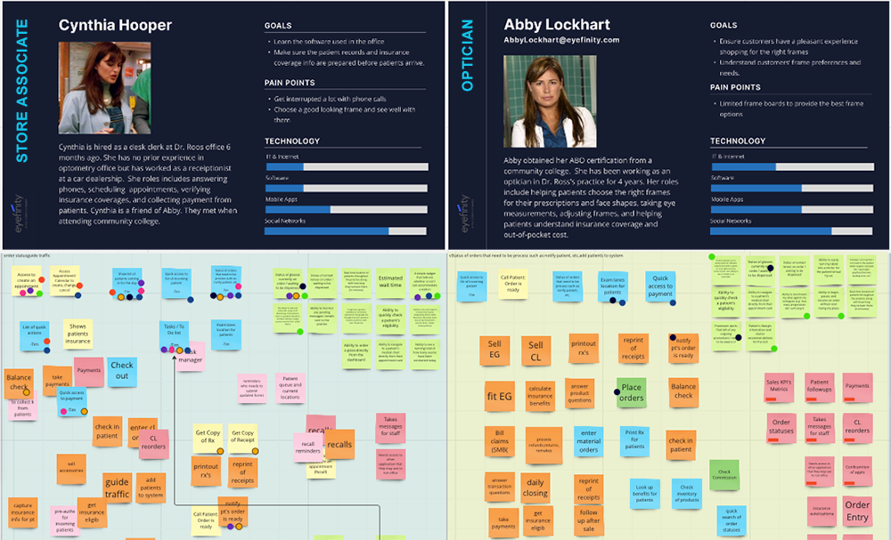
Findings
Store Associates:
- need a dashboard to manage all tasks for customer information + Appointments.
- two way messaging from desktop, to communicate with patients.
- guided shopping and step-by-step order processing.
- clear, transparent view of order pricing, insurance benefits, discounts and offers.
- ability to accept and process multiple insurances per order.
- assurance of correct order processing before order completion.
Optician & Doctors:
- need a dashboard to manage tasks assignments.
- at a glance view of office workflow.
- Business KPIs.
Patients:
- need to feel welcomed and at peace with the whole optometry process.
- need clarity about insurance benefits, offers, and out of pocket costs.
- reminded about appointments, insurance changes, and order arrivals.
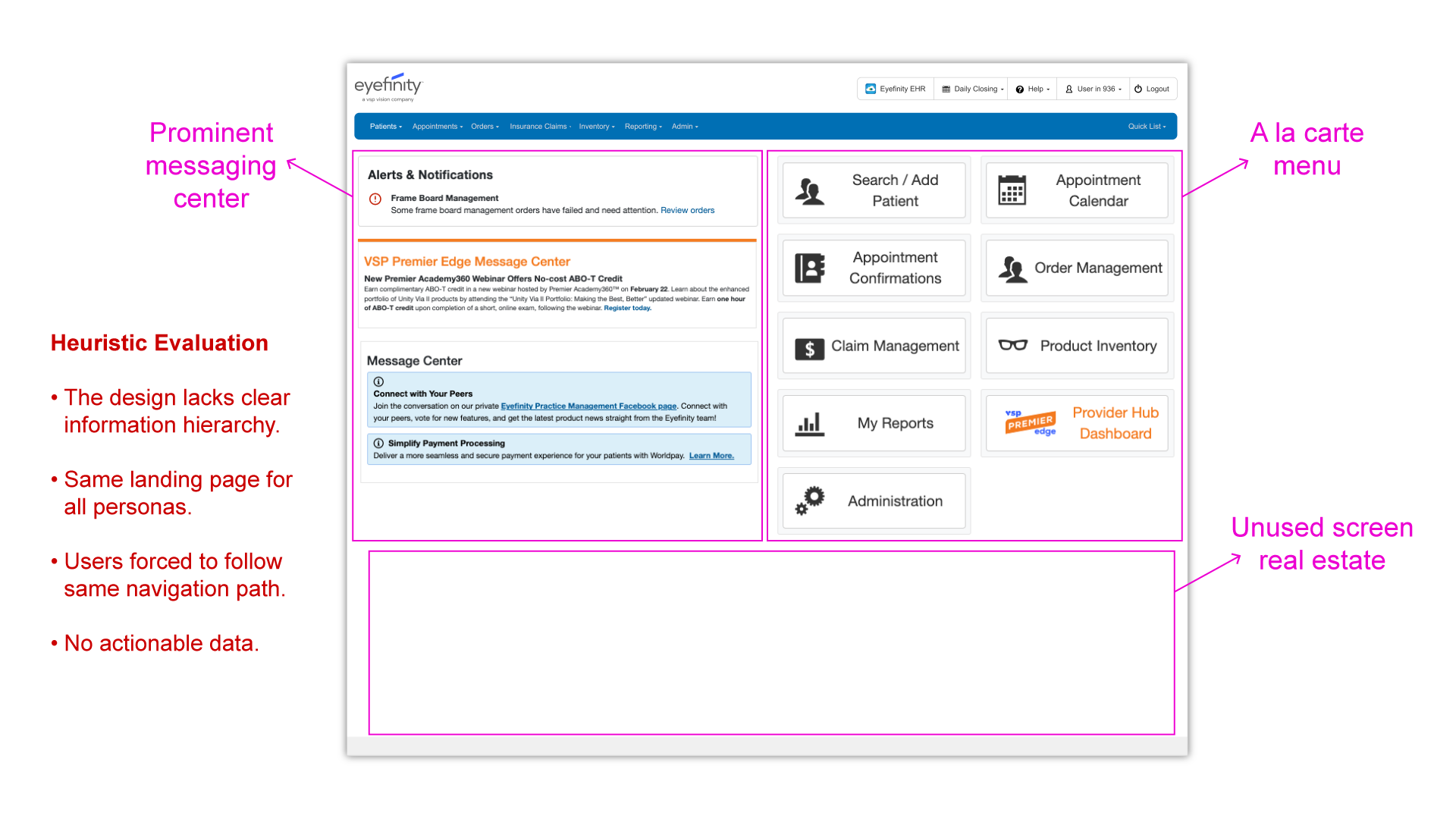
Heuristic Evaluation
Product Landing Page
The product landing page offered a limited and outdated user experience. All user personas landed on the same page and had to perform the same actions every time. The landing page had a high cognitive load, lacked effective information architecture and design hierarchy, and had many elements competing for users' attention. It served as a distribution center, allowing individuals to find and navigate to the product area they wanted to work with, without opportunity for customization, access to actionable data, shortcuts, or made effective use of screen real estate.
Cognitive Walkthrough
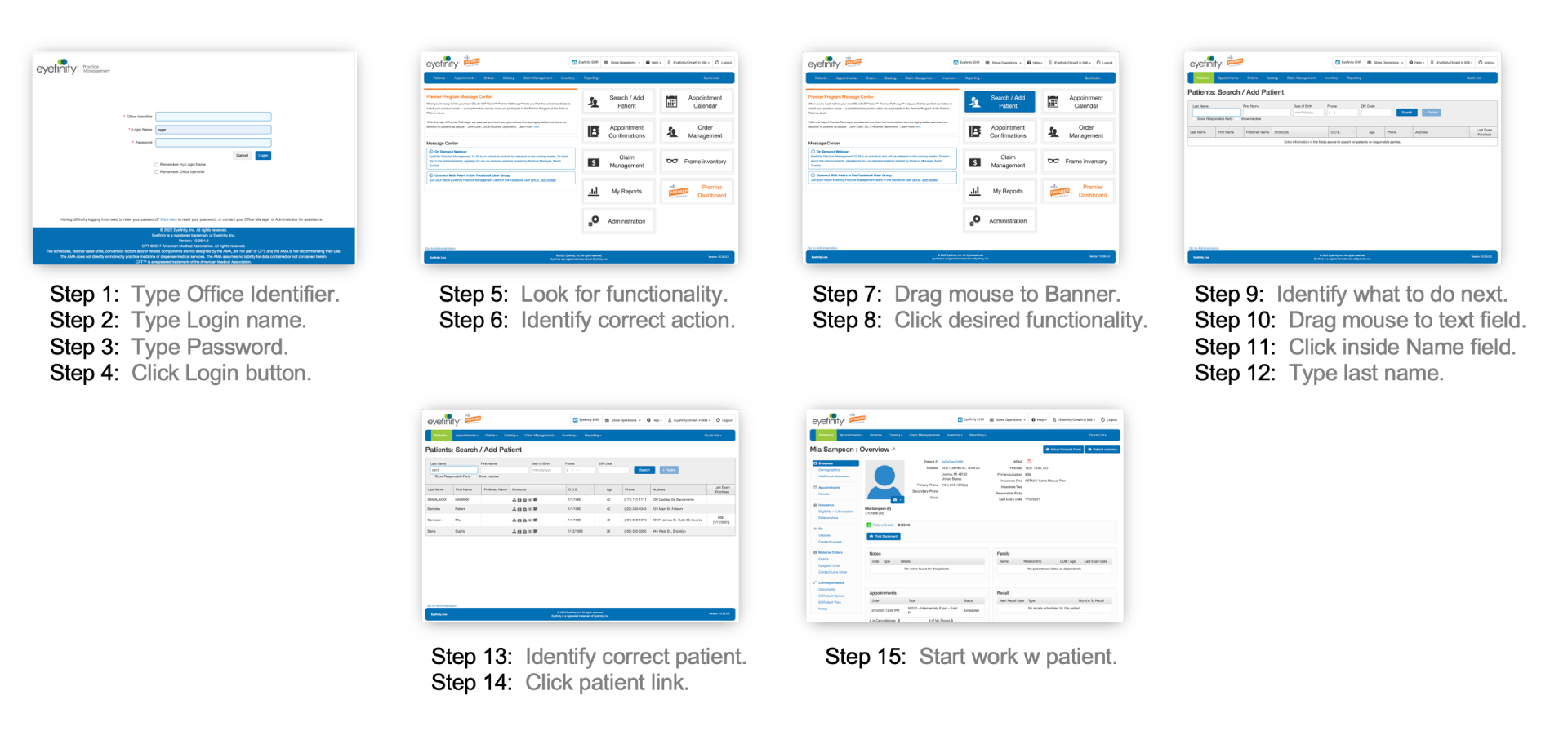
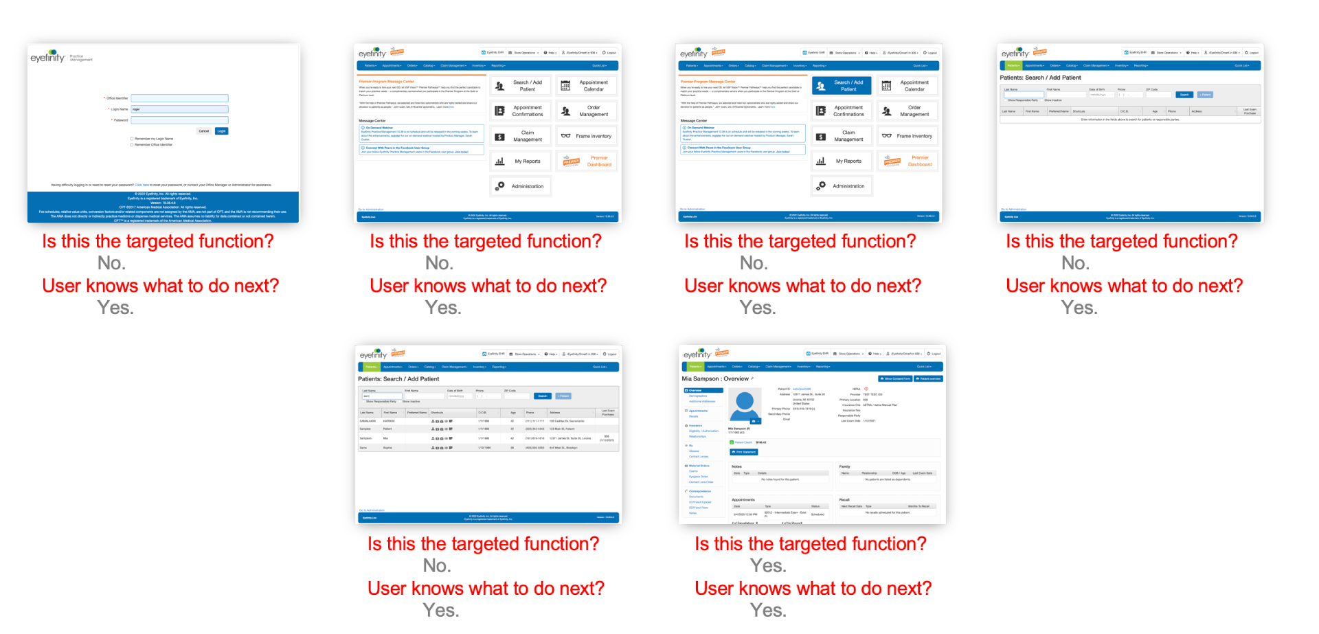
Product Workflow
90% of users need to perform a patient search 90% of the time, yet the landing page did not provide a patient search function. The process required a combination of 15 (cognitive and kinematic) steps to reach a patient's profile. Our new dashboard design allows key personnel access to multiple patient profiles, a search function, and much more.
Solutions
Associate Dashboard
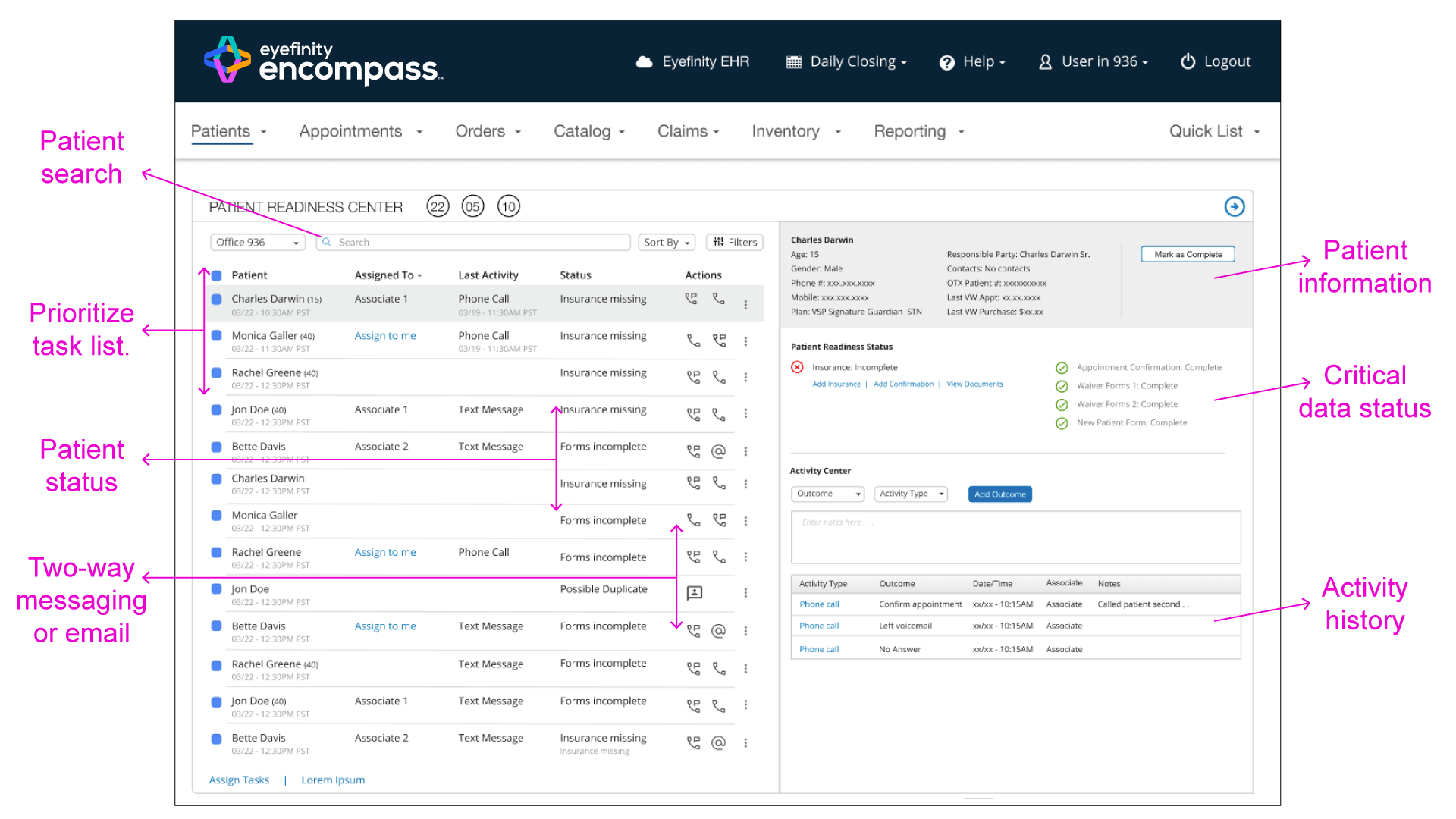
Encompass's dashboard displays a prioritized and curated task list, enabling office personnel to determine the next steps and take direct action on the screen, reducing wasted time and employee frustration.

Associate Dashboard - Heuristic Details
This customized dashboard allows store associates to directly access the data and information they need to interact with, including a curated list of the most critical tasks organized hierarchically from top to bottom, Patient search, status, and prefered method of communication, with direct in-app two-way texting.
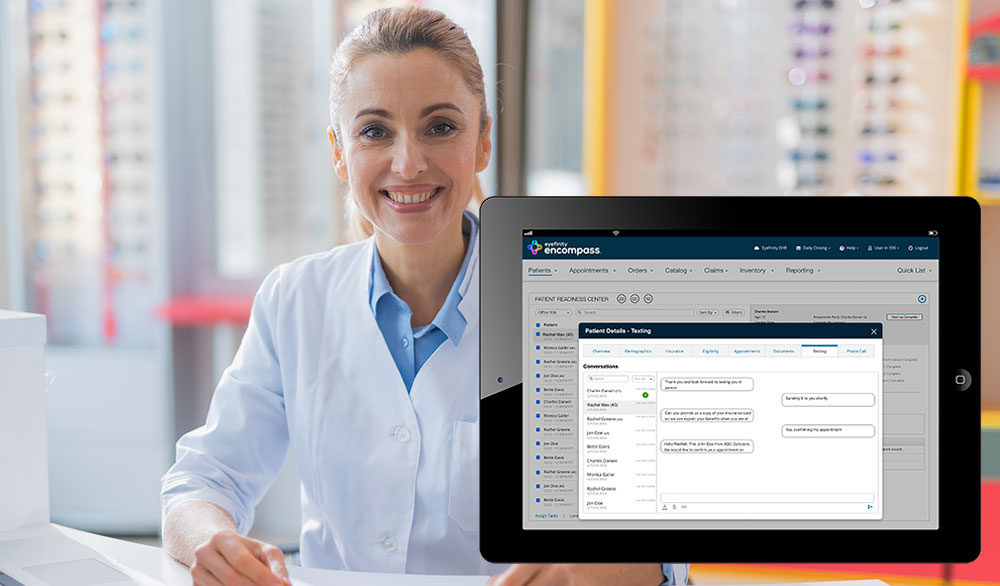
Two-Way Messaging
Optometrists and office staff can now communicate directly with patients through their dashboard, increasing efficiency and expediting appointment readiness.
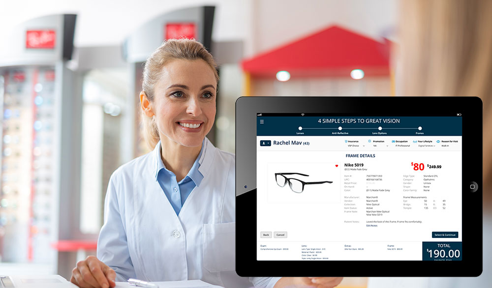
Step-By-Step Order & Price Transparency
The new design guides staff step-by-step through the order process, allowing real-time modification of order details and ensuring an exceptional experience for personnel and patients.
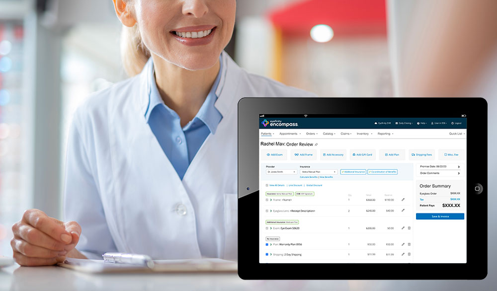
One Order - Multiple Insurances
The new design allows patients and Optometry practices to use multiple insurance policies for a single order, which benefits both parties.
Order Makeability
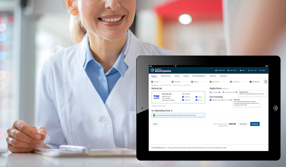
Our new design enables optometrists and office personnel to ensure accurate order processing, detect errors early, and prevent order failures through AI's makeability feature.
