Data Center Dashboard
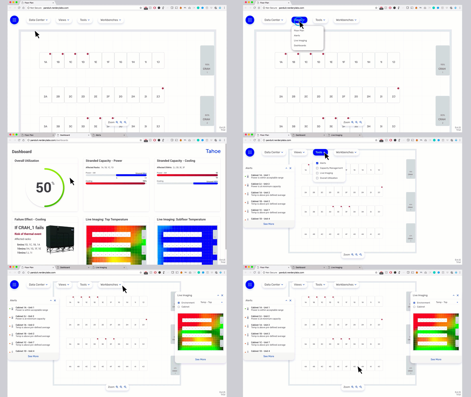
The dashboard design aimed to give data center managers complete usability freedom. They can now use multiple instances of the application, each in a separate browser tab. Moreover, they can access detachable pallets to view various data points simultaneously and arrange them across multiple screens. This redesign provides a superior user experience, allowing data center managers to monitor critical data center drivers more efficiently.
User Testing
Dashboard
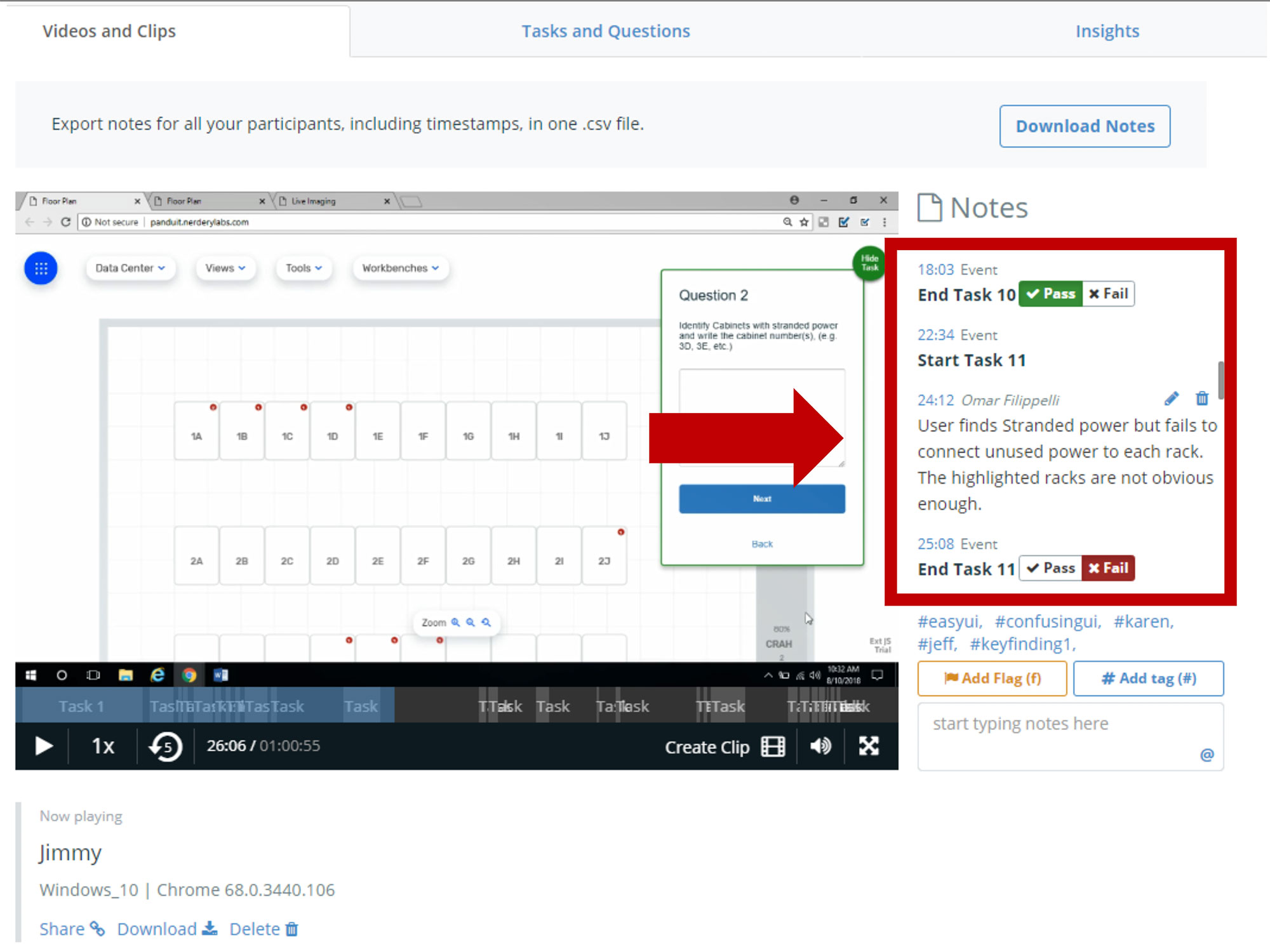
For the first round of testing the vendor hosted the prototype for us. I used 'Validately' an online tool to help with remote synchronous and asynchronous testing, video recording, on the fly notes, time stamped tasks, as well as moderated/unmoderated sessions.
Prototype - Test 1
Tool Flexibility
The Validately tool allowed me to run tests remotly while viewing and hearing users interact with the prototype. The moderated or unmoderated capabilities gave me plenty of freedom to interact with users if needed or just be a fly on the wall, and observing users behaviors without any input or interruptions.
Prototype - Test 1
Failing Tasks
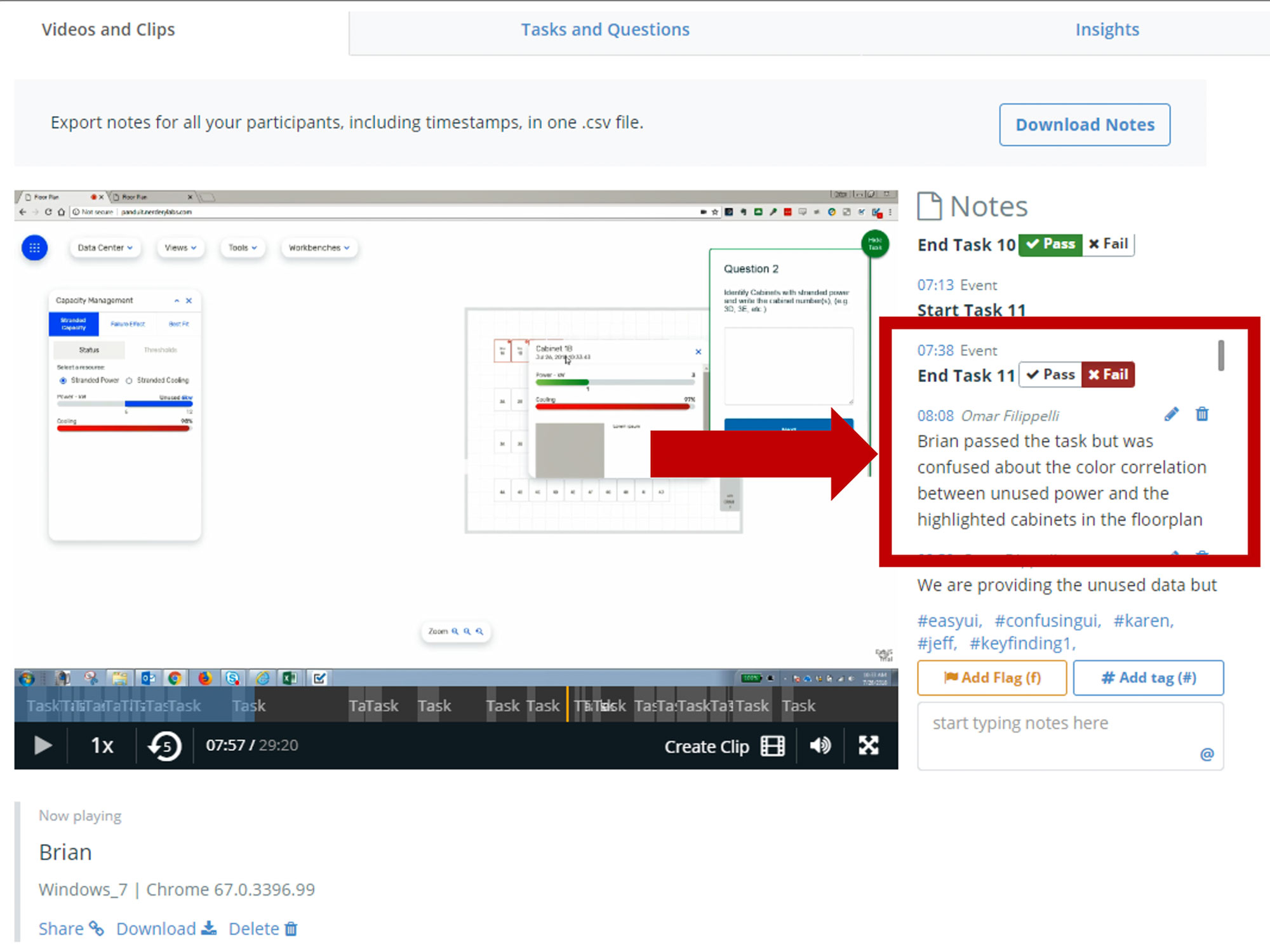
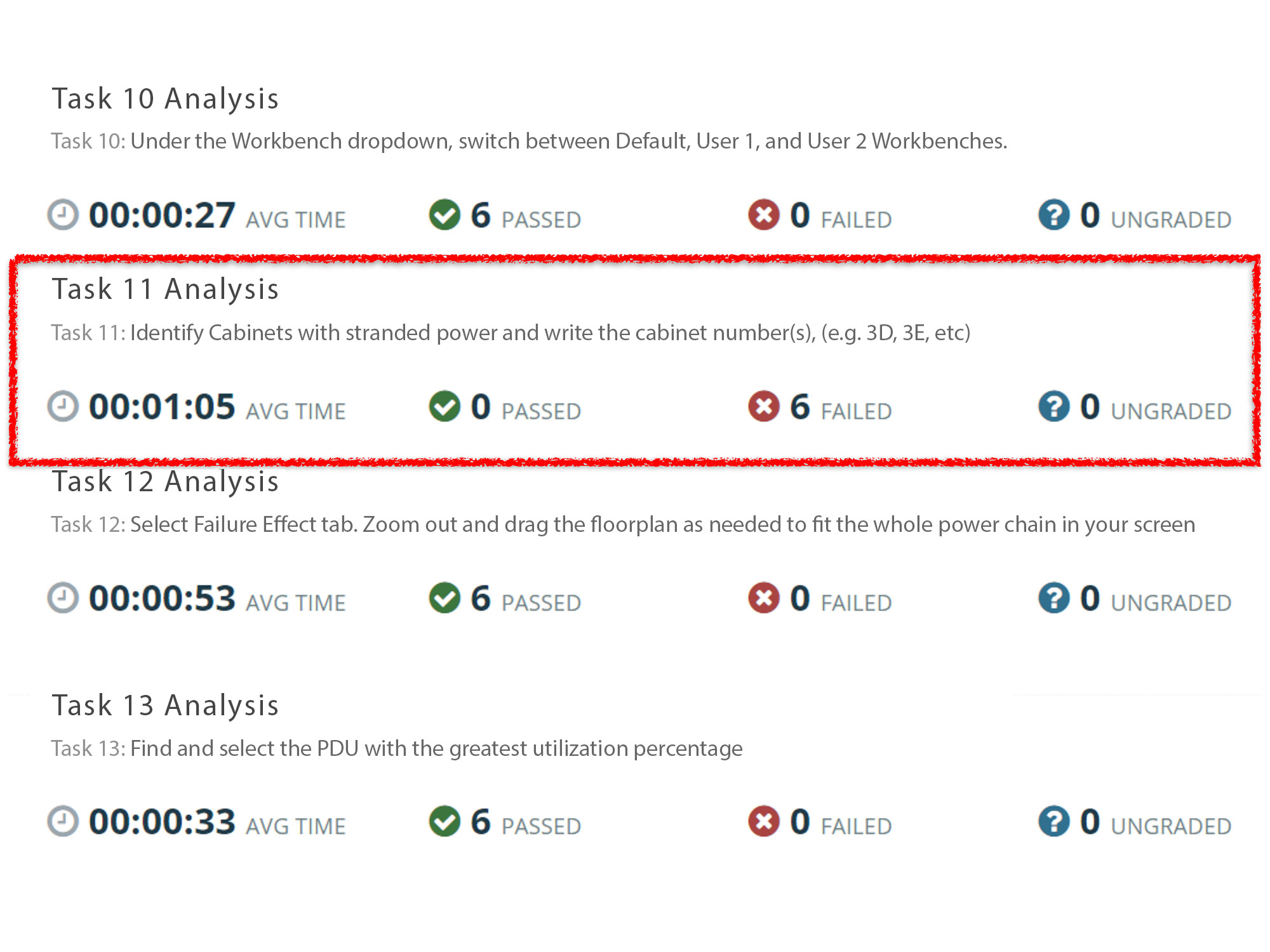
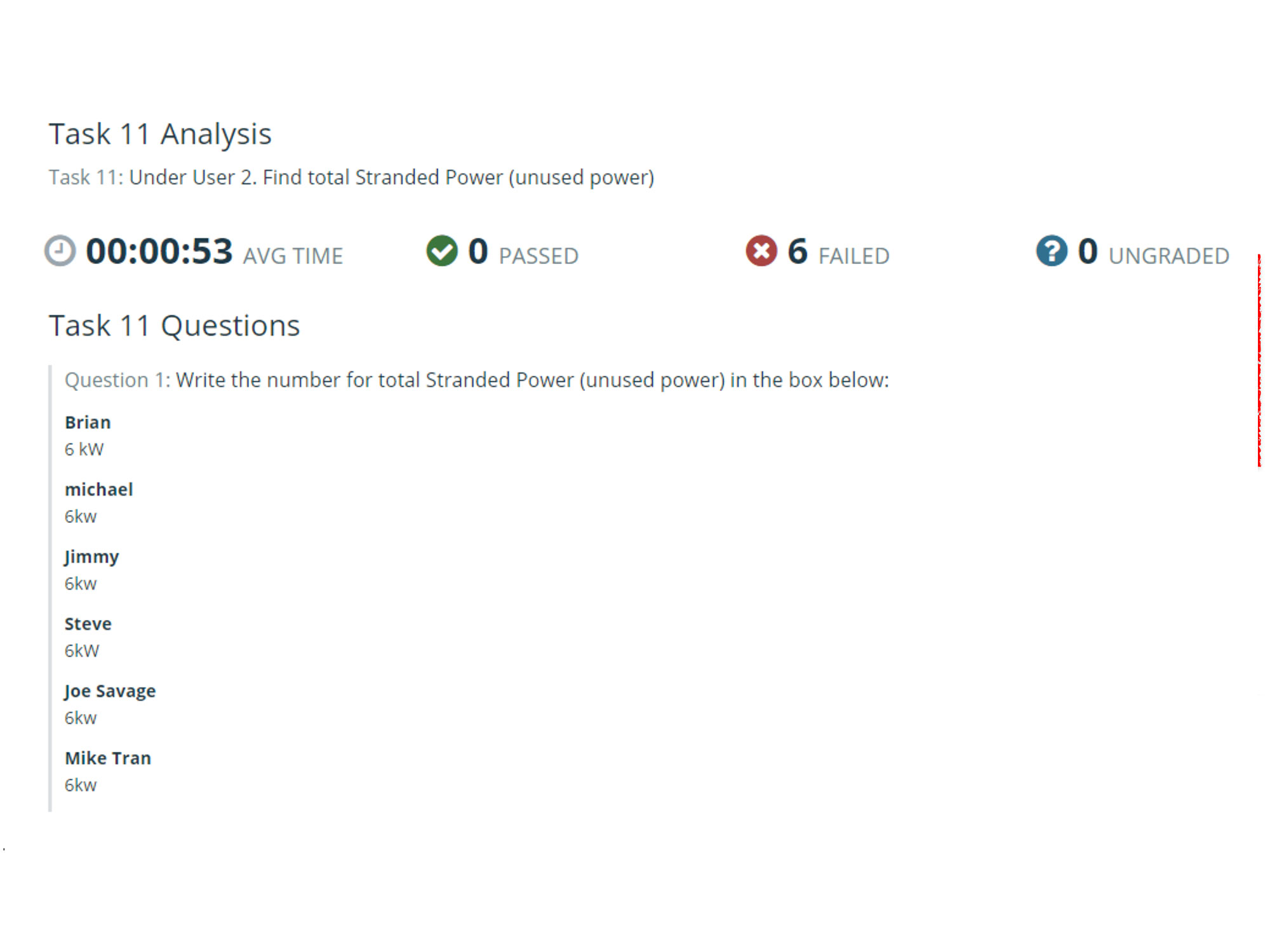
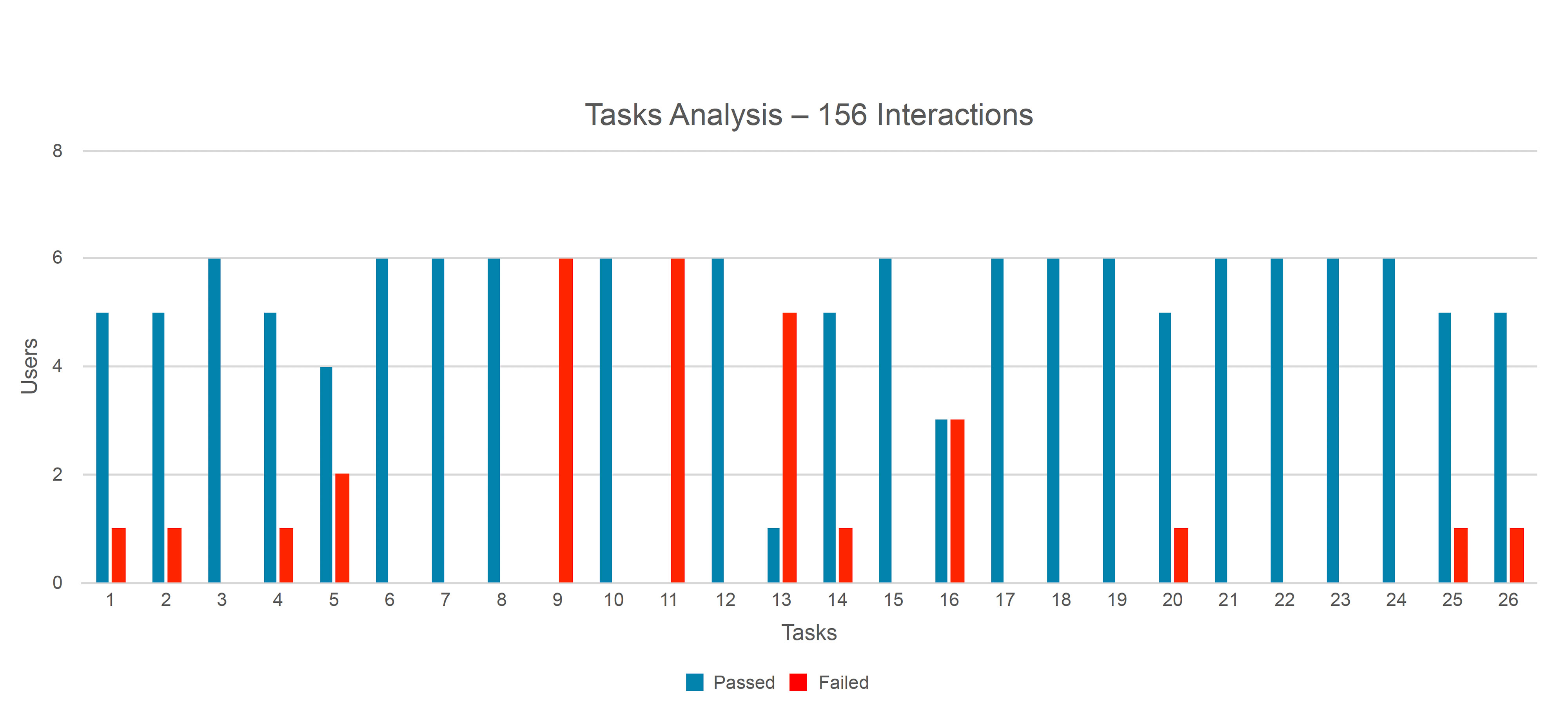
Tasks 11 proved to be difficult for most users. Even when people were able to complete the task by answering the questions, I considered it as failed. Because users either took too much time to find the answer or they arrived to the wrong conclusion. This was a major finding that bypassed all of our prior internal testing.
Prototype - Test 1
Task 11 Analysis - Q 1,2
On this example, question 1 asked users to find a specific data point. To find this answer users needed to know where to click in order to find the right number. All users arrived to the correct place and easily recognized the right data (6W). For question 2 all users arrived to the right answer as well.
Prototype - Test 1
Task 11 Analysis - Q 3
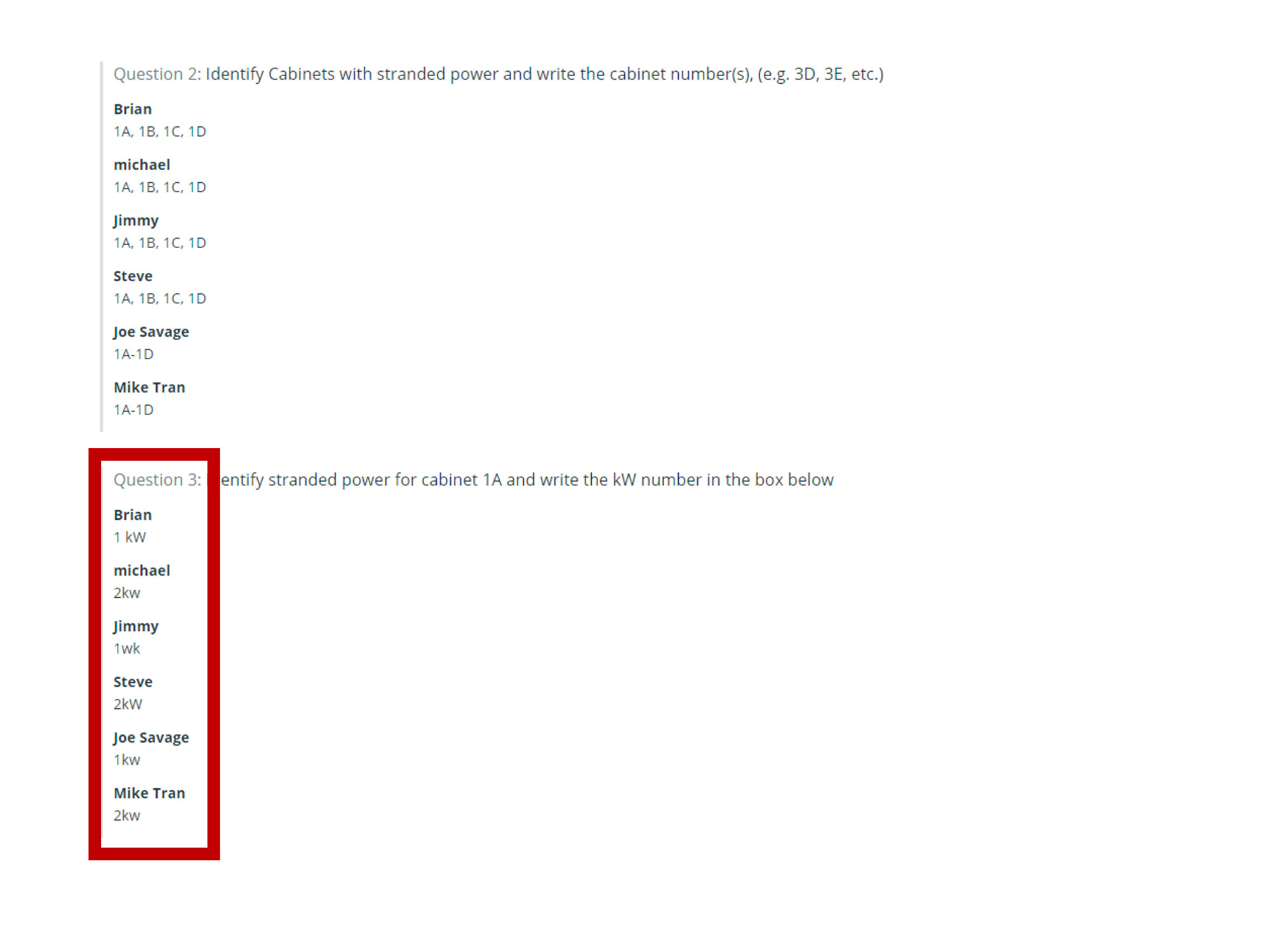
For question 3 there was something in the UI that confused users. Only half of them arrived to the correct answer. The UI design forced users to do some mental math in order to calculate the answer. The redesign included a new algorithm to calculate the answer for them, and provided a clear visualization of the correct data.
Prototype - Test 1
Aggregated Tasks Analysis
The research was conducted remote, allowing users to have full control of the navigation. Clear and concise tasks directed users to find critical answers to common data center needs. The Validately tool allow me to watch user interaction and hear their mental mapping while looking for the answers. The testing showed us several design flaws. Some of the colors used to highlight data points were confusing, driving users to wrong data conclusions. Other problems included poor or incomplete algorithm design, and redundant information that added unnecessary cognitive-load. These and other findings helped us make quick adjustments to the prototype which we turned around in a week for further testing.
